12 Pinterest Pin Design Mistakes You Must Avoid For Professional Looking Pins
Do you want to create a professional-looking pin for Pinterest? Then you should avoid these 12 Pinterest Pin Design Mistakes. Also, read how to design pins to attract an audience to your pins.
Nowadays Pinterest is the most used source of free traffic by many users. Because of its quality free traffic and leads from Pinterest.
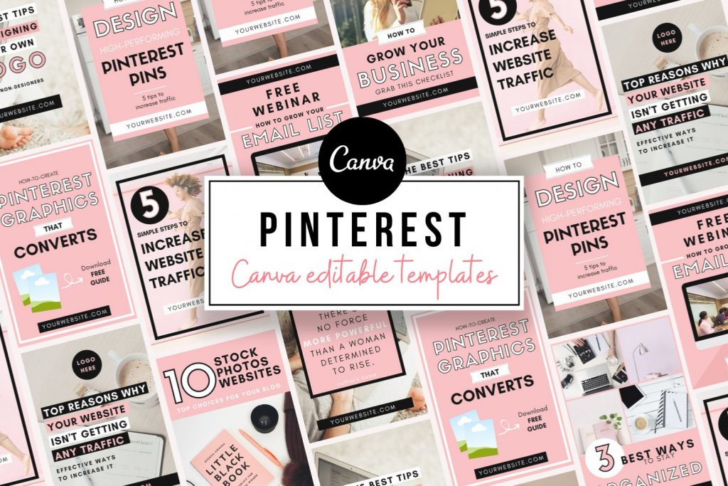
I am a Pinterest Marketer who knows what are mistakes you should avoid to start getting traffic from Pinterest. These pins are easily created by templates using Canva.
Yes of course. Canva is the best online free photo editing website. Here you can create multiple social media graphics for free.
First, try to analyze the Pinterest pins that are showing in the home feed. Also, check the pins at the top while searching for some keywords.
These pins are professional-looking pins. So if you want to create pins like those then you should read these 12 Pinterest pin design mistakes to make sure you avoid these.


Pinterest Pin Design Mistake 1 - Contrast
While creating pins you should use bright colors like pink, orange, red. Also, you should use color contrast to the colors in the pins.
You can use the same color of the pin’s background image to create an overlay. But you should add text that is in contrast color to the pin’s background.
Why? If you are not using contrast colors, then your text won’t be visible to the audience. So make sure to avoid this Pinterest pin design mistake while creating pins.


Pinterest Pin Design Mistake 2 - Use Script Fonts Incorrectly
Make sure to use the script fonts correctly. How? Don’t use all caps in script fonts. Also, don’t use the signature fonts here.
Some signature fonts can be used here. Use fonts that are easy to read. If you want to know more about font mistakes, then read these 8 font mistakes to be avoided by bloggers.


Pinterest Pin Design Mistake 3 - Placing Elements Too Close to the edge
This is another mistake everyone should avoid while creating Pinterest pins. Make sure to leave some gap between the edges from the top, bottom, left, right.
Why? This will help you to create a focal point in your pins. Also, it will show your graphics better than others.


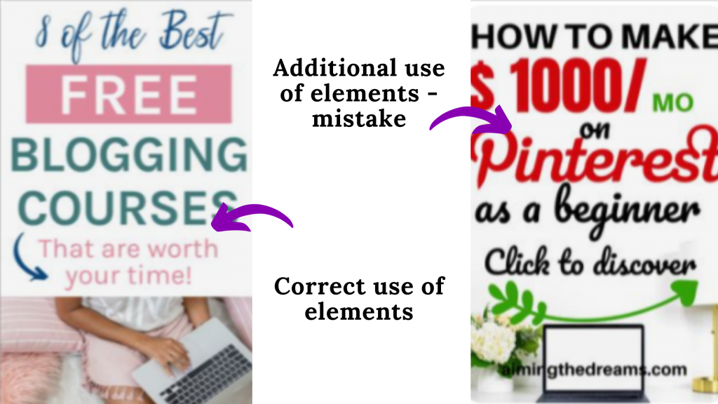
Pinterest Pin Design Mistake 4 - Don't add unnecessary elements
Your pin should attract an audience not overwhelm them. Just add elements that are necessary for your pin.
If you add unnecessary elements to your pin, it will distract the audience. Better to make it simple and easy to read.


Pinterest Pin Design Mistake 5 - Incorrect Spacing
This is another mistake that is made by most bloggers. Don’t leave spacing off in pins.
Add the text and elements without leaving space off. Don’t leave more space between each element. Adjust the spacing based on the pins.


Pinterest Pin Design Mistake 6 - Misaligned Text
Text elements should be arranged in a hierarchy. All the text in the pins should be arranged in the arranged without spacing off.
For example: Use bold, sript fonts correctly in the text. Align all the fonts in the pins should be arranged like this.


Pinterest Pin Design Mistake 7 - Don't use Small Fonts
Use fonts that are readable. Also, make it in different sizes and styles. Here you can bold the keyword and use it in big size.
This will create a focus on your pin. Else you can use script fonts for your focus keywords.


Pinterest Pin Design Mistake 8 - No Visual Hierarchy.
Arrange the visual elements in a hierarchical manner. How? First, if your headline has a number then you should add it first in the pin.
Then add text i.e heading of your post here. After that add your Cta at last in your pin. This is what your visual should look like.
Pinterest Pin Design Mistake 9 - Overused Stock Photos
You should use some other feminine stock photos in your pins. Don’t use stock photos that are overused by all.
If you want to know how to use the stock photos, then you need to read this 10 Design Hacks For Using Stock Photos For Bloggers


Pinterest Pin Design Mistake 10 - Bad Color Choices
Always select the colors which are suitable for your pins. You can also make use of your branded colors in your pin.
Nowadays in canva, it is showing the colors present in the image. You can make use of it while creating text or visuals in your pins.


Pinterest Pin Design Mistake 11 - Not Adding Url In your Pin
This is the most important mistake everyone should avoid. You should add your URL to your pin. So that it is easy for your audience to identify your website.
In turn, it helps you to get more repins, follow, and traffic to your website. So try to add URL to your pin.


Pinterest Pin Design Mistake 12 - Wrong CTA Placement
You should place the CTA in the correct spot in your pin. How? You should follow this template to avoid it.
Correct placement of CTA helps you to get more traffic and leads to your website. This in turn helps you to make money also.


To Get More Updates


